|
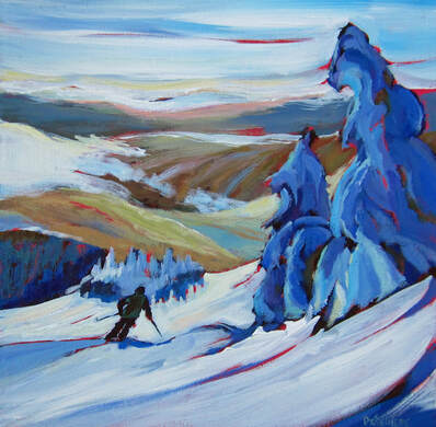
What does that even mean "be a good liar" ? It means that in order to convincingly tell something that is not true, you have to add some really believable true elements to your statement. Like :" Guess who sat beside me on the Earls" patio on Main street, it was (insert famous person name)" . Because you included a bit of verifiable truth (the Earl's on Main), your false statement (in reality no famous person came to town;( ) appears more believable. So, it's the same for painting. You want to use wild crazy colours in your landscape or cityscape or portrait, it will be more believable if you maintain some truth, in this case, truth as perspective and proportions. Viewers know when roads are drawn all wrong, like not going smaller in the distance, or trees don't make sense with the main trunk smaller than the branches! so pay attention to those details and then enjoy going wild with the colours or other elements of design. 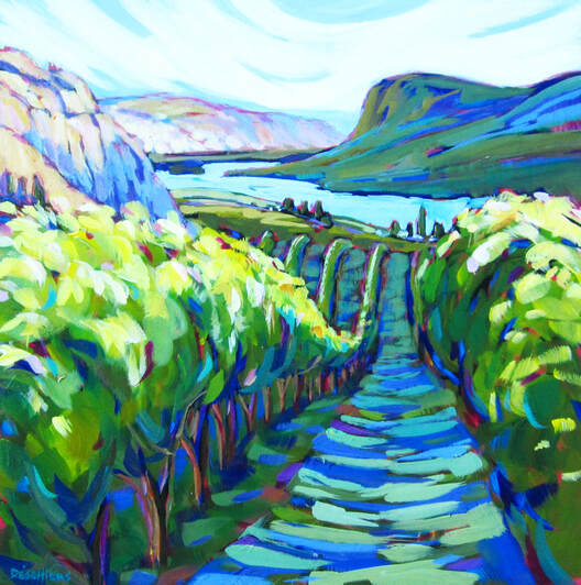 Wine country 24x24
0 Comments
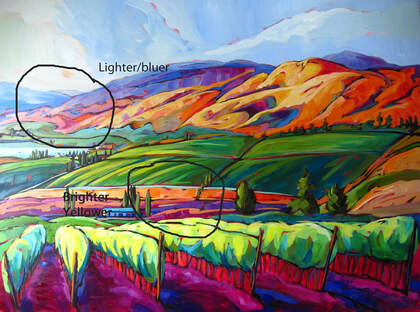
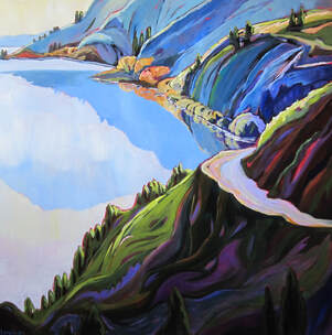
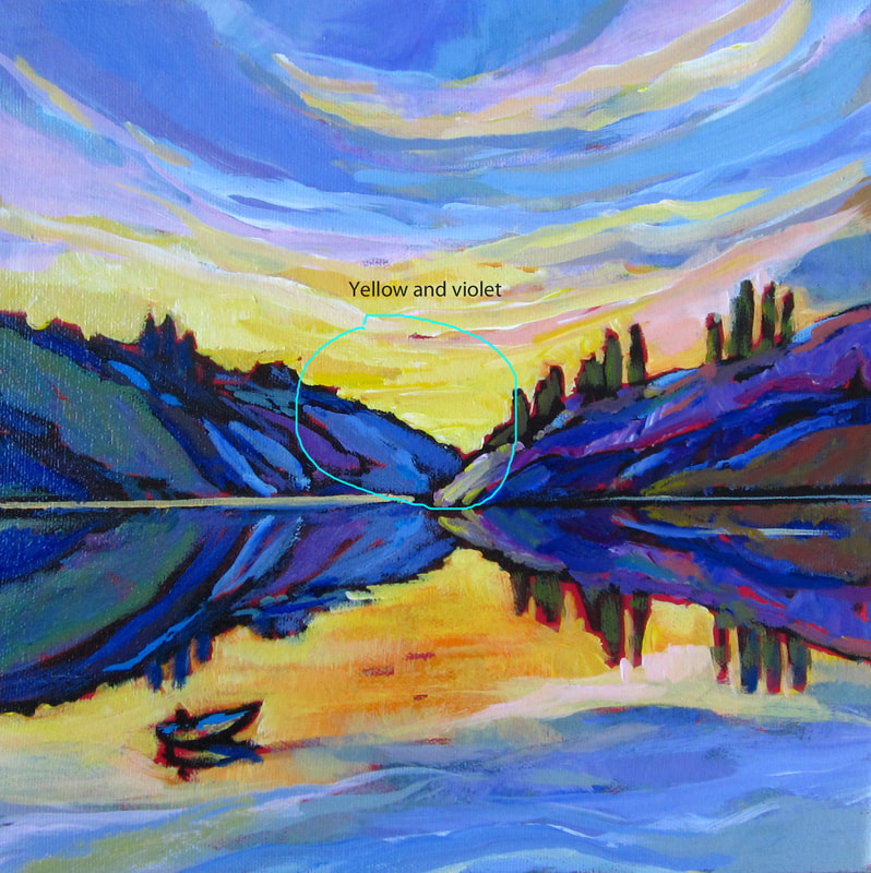
Using neutral colours (made by mixing a tertiary colour or mixing complementary colours together) like a yellow mixed with a little blue violet, can off set pure expressive colours a lot more than when the entire painting is made with bright saturated colours. It's like eating just super sweet foods and super salty foods without having some bland food in between to cleanse the palate. Bread would do the job but with a painting, neutrals do it just as well! 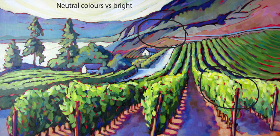 Different viewpoint 18x36 The colour green can often occupy too much space in a landscape painting. But to avoid "greenitis" you might want to vary your greens. Going with bluish green to very light cadmium greens. From a warm olive green to a cool phtalo blue green. It make all the difference to have variety and gradation with those green. And the warmest green come forward as the cool blue ones tend to recced. easy peazy! 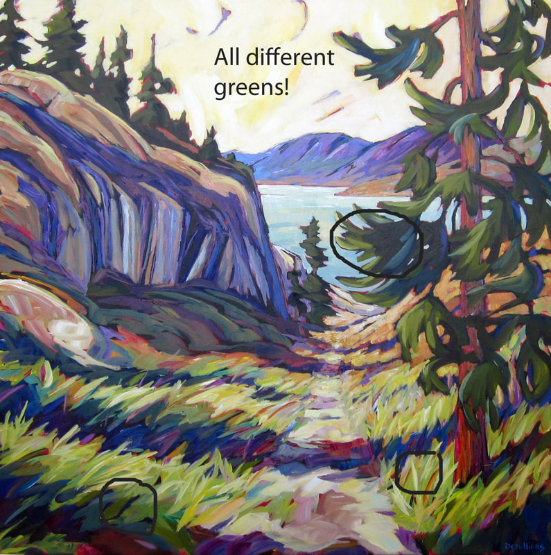 2 billion years old and counting 36x36 When at all possible (and why would it not be?) try in incorporate a gradation in colour throughout a shape from top to bottom or right to left. Like within the shape of the sky, or a big hill or mountain, or the surface of a lake. Going from a darker tone to a lighter one, from one colour to another one. It always creates interesting effects and keep the viewer viewing! 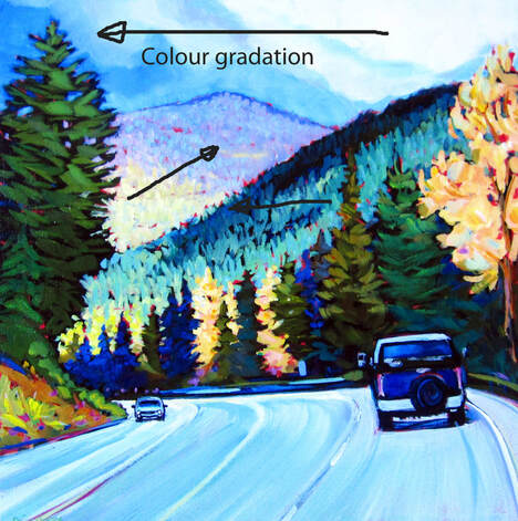 Not wanting to be Capt'n Obvious here but Shadows run from the object in the opposite direction to where the sun is and Reflections in the water always run directly toward the viewer. So 2 different things to consider if painting the edge of a lake on a sunny day. The Shadows might be pointing west (if the sun is in the east) but the reflections will be pointing south if looking in the direction of true North. An image is worth a thousand woods: here the trees are reflected in the water with their reflection running toward the bottom of the painting (or the viewer as always) and the shadows of the reeds on the dead tree are dependent on the direction of the sun which is on the left side of the painting as this is morning on Skaha lake looking South. Simple right? 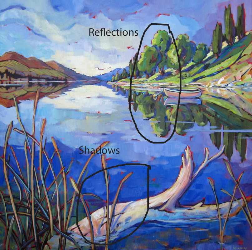 Nothing says more "come along, come on, follow this road" than a pathway/back alley which opens up at the bottom of the painting. But then again, even if you love to get away with "crazy bold colours" or all kinds of objects (garbage bins, garages, trailers, meandering marauders) along that road, you still have to respect one rule: the rule of perspective. With progressively decreasing objects' size lining the road and a single point of perspective (lines pointing to one point in the distance). Otherwise, if it's all wrong, one feels light headed looking at the painting or perhaps even slightly nauseated, not knowing for sure what's wrong, oh-my-let's-look-at-something-else-instead kind of feeling. so draw some lines if needed and keep to the overall directives. Ok the road may go up and down a little but you get the idea. You may now enter... 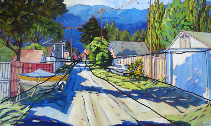 Slendid idea 36x48 When we look outside, we all instinctively know what is far and what is close to us. But try painting that and be convincing? That's when you want to use 'atmospheric perspective'. Due to the layer of atmosphere (air) between the object and the viewer, the far away objects appear whiter and bluer. Keeping this in mind while painting gives depth to the landscape painting.
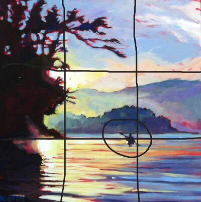
Every artist has been told to have a focal point in their painting. "It's the entry point! It grabs the attention of the viewer!" But it's just (sometimes) hard to either choose one or even remember to put one in. So what if you missed planning your composition with the all important focal point at the typical intersection of the thirds (painting cut in thirds with lines intersecting in 4 spots). Just add it in, with more contrasting colours, or more details, or more texture. Try it, add one in if forgotten it will help harmonize and balance the painting.
|
Archives
November 2020
Categories |

 RSS Feed
