|
You want to created a harmonious painting, a painting that creates a sense of calm or order? Using fewer colours and using analogous colours will do just that. Analogous colours are the ones that are close to each other on the colour wheel. Like yellow and orange or yellow and light green, or blue and bluish purple. Sometimes, simplifying one's palette can leads to beautiful results. 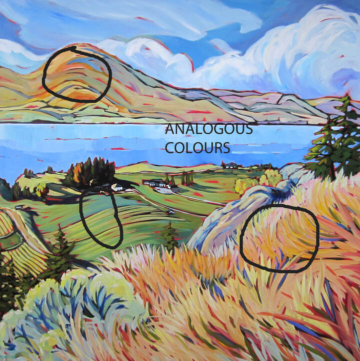 Warm winds 36x36
0 Comments
Negative painting is at the centre of what I do, how I paint. It's often where the fun is or where the tricky stuff comes in. When someone paints the sky first and then the land and then paints the trees and the houses on top, that's called positive painting. When someone starts with an underpaint (covering the entire canvas with a given colour, and mine is a kind of quidacridone red), then draws in the shapes with little attention to details (I do it in black) but then comes in, per example, with the blue of the sky to form the shape of the trees, or the colour of the rocks to outline the grasses near by, that's called negative painting. Tom Thompson was a negative painter and I once read that his Group of 7 friends complained that he was grumpy because he always had to paint the space (sky) between all the leaves and branches, which was tricky and sometimes tedious. But I so enjoy creating shapes with a loose version of negative painting, leaving a fair bit of the underpainting showing up beside the shapes. These little unpainted areas are called Holidays. Cute, isn't it? 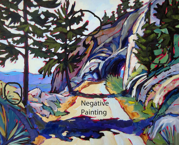 Made it to the tunnel 16x20 How about trying to use a strong and unusual points of view? From way above or from the ground up? It add interest and it's easier to direct the viewer in the direction you want them to go within the painting. 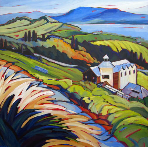 Clearly remember 36x36 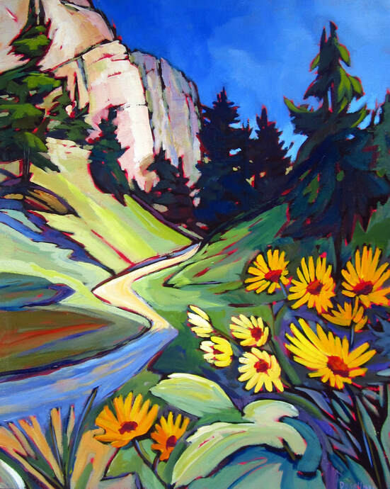 On the way to Skaha bluffs 16x20 Ah, the lure of the open road. Nothing says "let's go" more than strong curves with decreasing width, as far as roads go. So compelling! 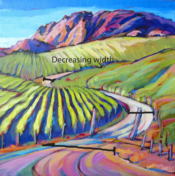 Follow that road 12x12 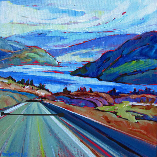 Welcome to Lake Country 12x12 If you are painting a sunny scene, it's "vraiment important" to remember to keep in mind where the sun is. At what angle are the sun rays coming into the scene and therefore what are the shadows going to look like. It has to make sense, all of it, each object with it's shadow to render the scene credible. Use a ruler to check the angles if needed. And add some light sun-kissed accent to your work and it will sing! 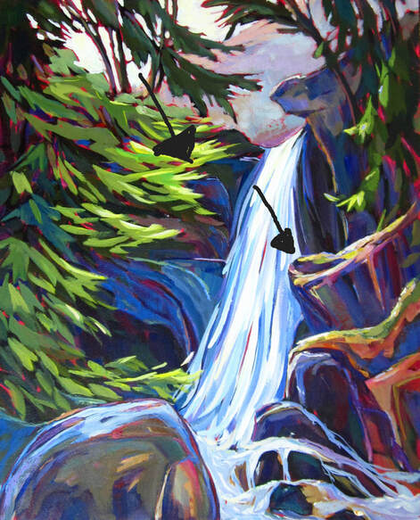 Canyon falls park 20x16 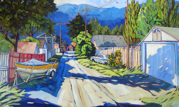 Splendid idea 36x48 There a lot more interesting things to look at in life than 3 things that look exactly the same. But it's a start. It gives some rhythm to an image, as the eye jumps from one to the other. But what is even better is when these 3 things are slightly different. then you get interest AND rhythm. Cool! 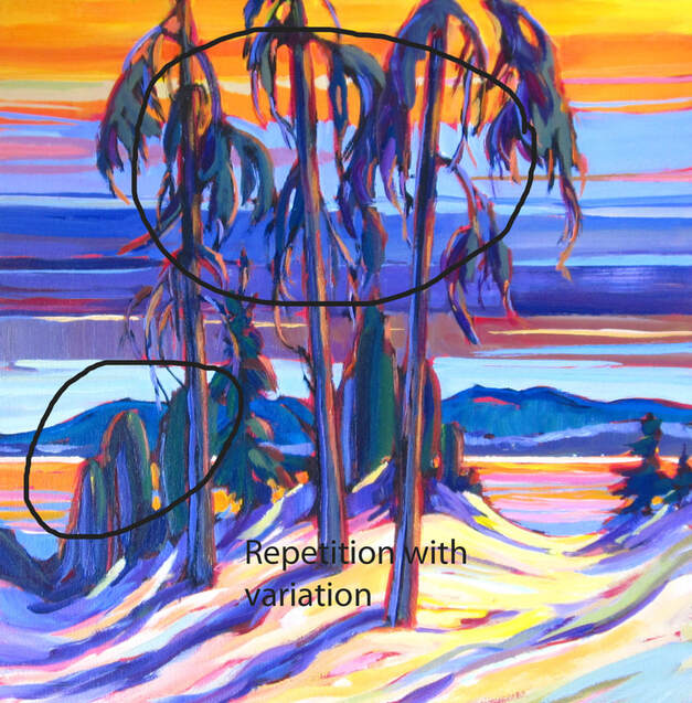 Water has a tendency to reflect light objects slightly darker and dark objects slightly lighter. In other words, real life is on the extreme of the contrast (light/dark) spectrum whereas reflections on the water is on the inside of these outer extremes on the spectrum. Makes sense if you've had a glass of wine. So ask yourself, "Is that rock really bright in the sun?" if the answer is yes, make it a bit duller once painting its reflection in the water. "Is this tree shadow super dark, almost black?" If so, it's going to be lighter in the water. Get the idea? 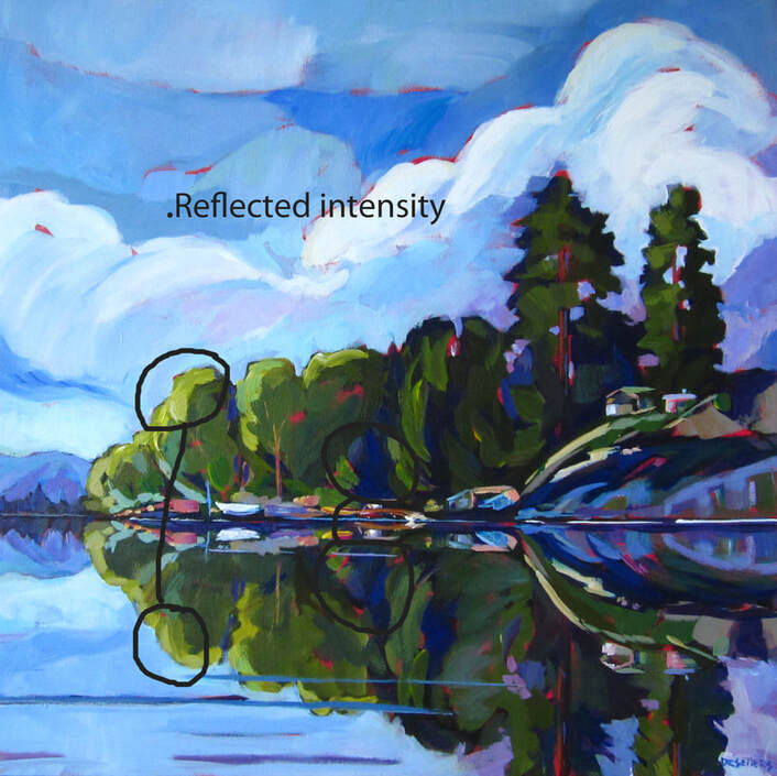 A reflection 24x24 When you paint a path/road, and you want to encourage the viewer to go down that path into your painting, one way to do that is to put something interesting at the end of the road/trail. So pick a distant focal point like "oh, what is this sweet little house in the distance?" Makes you want to enter into the painting to go see it right? Absolutely! 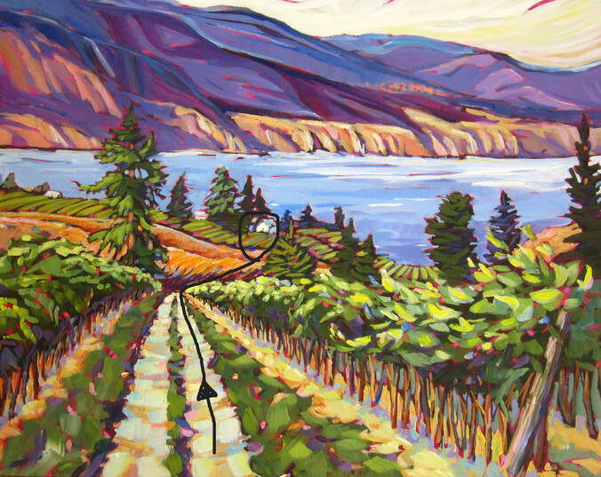 One way ticket 16x20 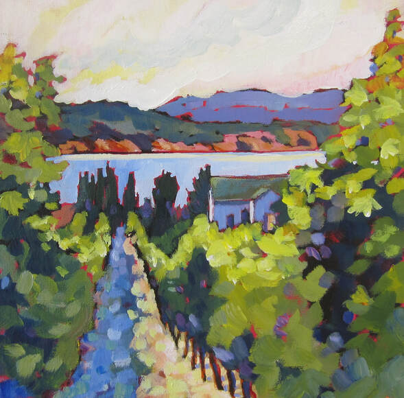 Down the row 12x12 A good trick to "unify" a composition is to repeat a colour elsewhere in the painting. If you use red somewhere, you can add small touch of red in two other locations. I like to "triangulate my repeats, with the three areas of very similar colour forming a triangle in the painting. I don't know for sure if it helps liven up the piece but I find myself jumping from the blues to the blues and the oranges to the oranges, linking the dots and therefore creating in my mind a network. Sometimes, the colour will be duller in the distance but it still reads as the same colour. 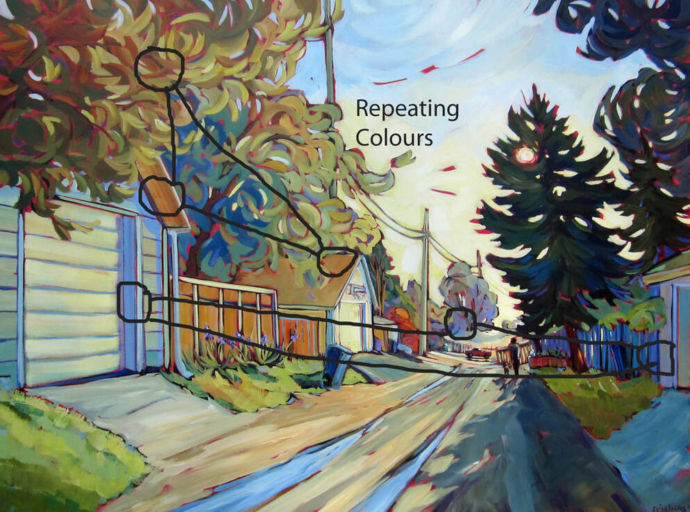 Fresh from the rain 36x48 |
Archives
November 2020
Categories |
 RSS Feed
