|
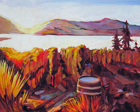
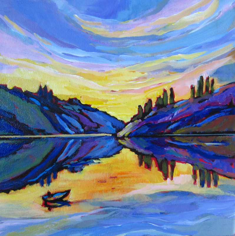
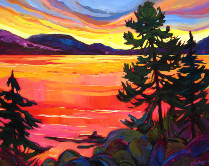
Once in a while, it's a good exercise to try to limit one's palette to work more with tonality and saturation. Choose 2-3 analogous colours (beside each other on the colour wheel) and go at it. You will get a harmonious painting that shows you that composition is way more important than using a broad variety of colours.
0 Comments
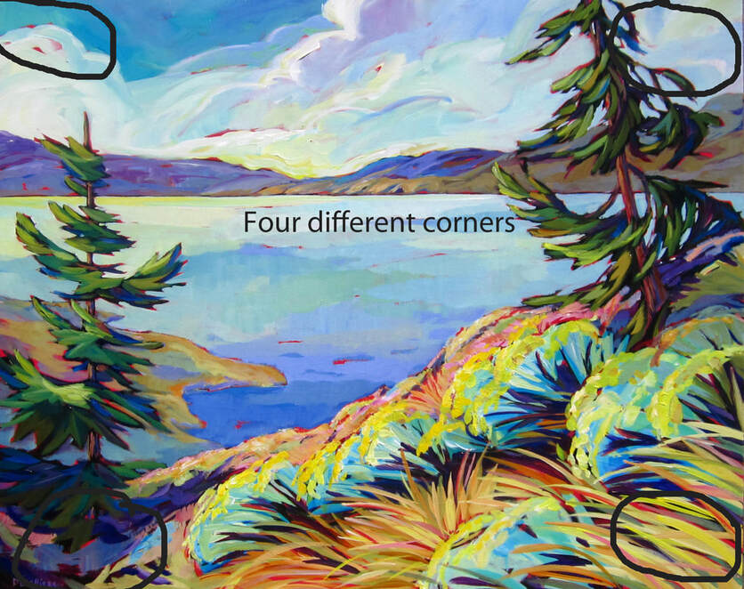
Now there is nothing wrong with having four corners the same in a painting. It makes the painting look more like a vignette, a technique used in the past in which the border of the image is blurry. But, if you want a more dynamic looking painting, it's a good idea to pay attention to all four corners and make sure they are all different. I does not always work perfectly but it adds "un je ne sais quoi" to your painting. Try it next time. It also reminds you to use gradation and not paint a large area all the same tone or colour. It's good practice!
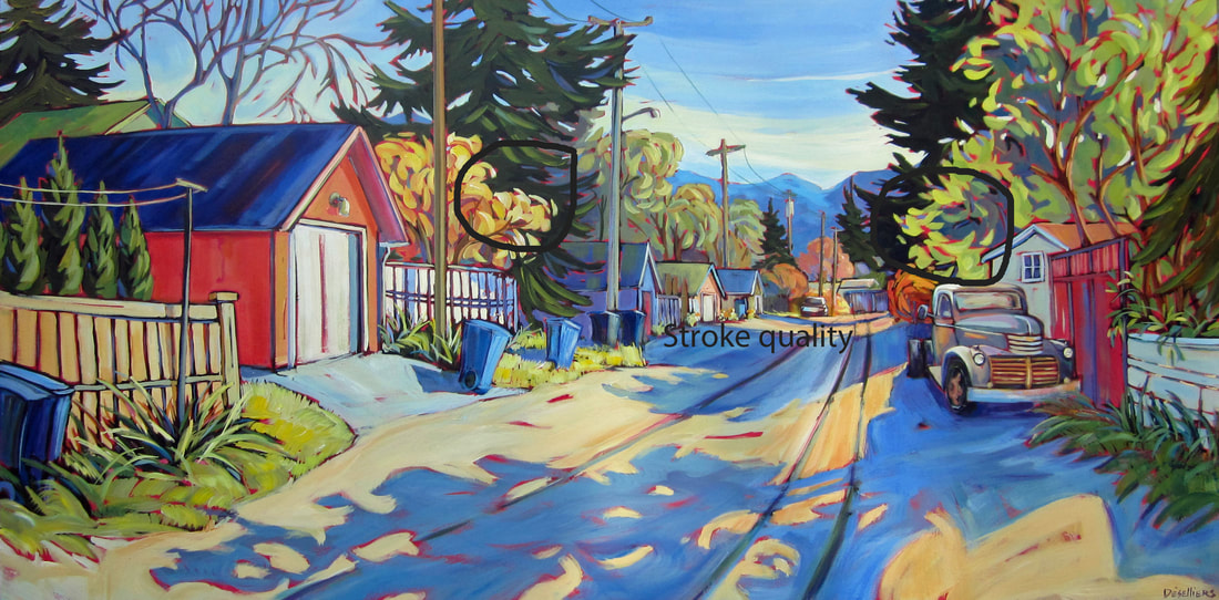
I have heard of artists taking their paintings into galleries in the hope to be represented and having the gallery owner get real close to the painting in order to examine it. You know what they are looking at so carefully? It's the stroke quality. The decisiveness of the stroke, the control of the edges (soft or hard), the way the paint brush is manipulated. It's a good way to judge if a painter is a beginner or an experience painter. Because it takes some time to be able to load up the paintbrush and apply the paint with conviction and energy, without unwanted frayed edges or smears. So feel free to practice the swing of the wrist, that softness of the pressure on the brush, remember that paintbrush are make with long handles for a reason. Use them and you will be surprise by the joyful strokes you can produce with practice.
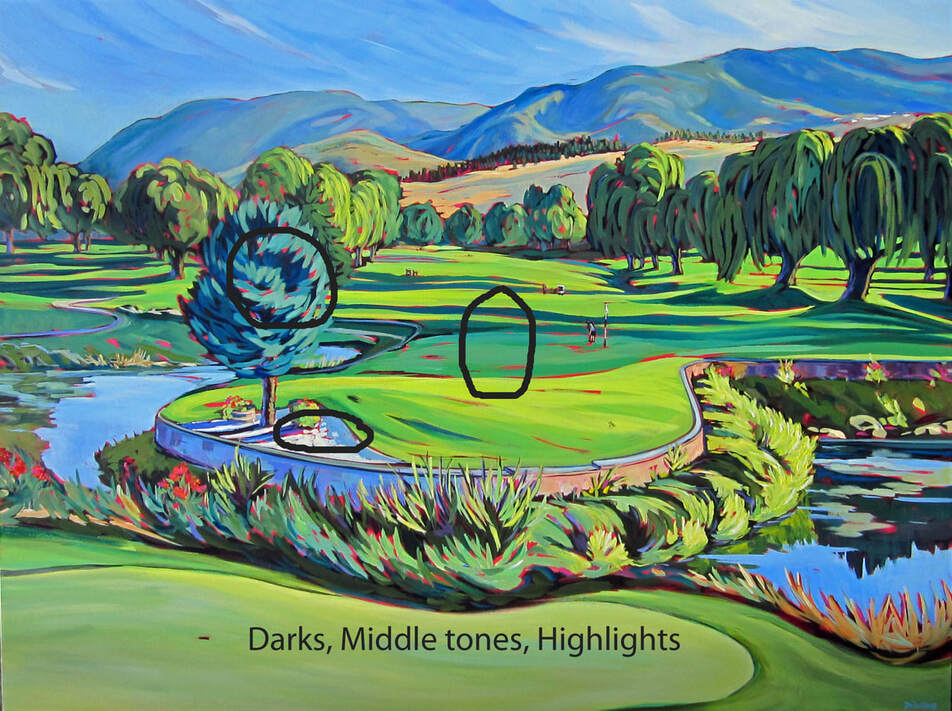
In an effort to give shapes a tridimensional look, I try to always ensure that each object (including mountains and grasses, everything) has a dark tone, a middle value and some highlights. And that's where knowing precisely where the light comes from is essential in order to position these 3 tonalities. I use to literally stick a little piece of paper with a sun or an arrow on it not to never forget where the light came from and to make sure I darn well showed that. So each bush, pole, rock will have at least 3 tones. Try it, it's a good exercise in mixing paint if nothing else.
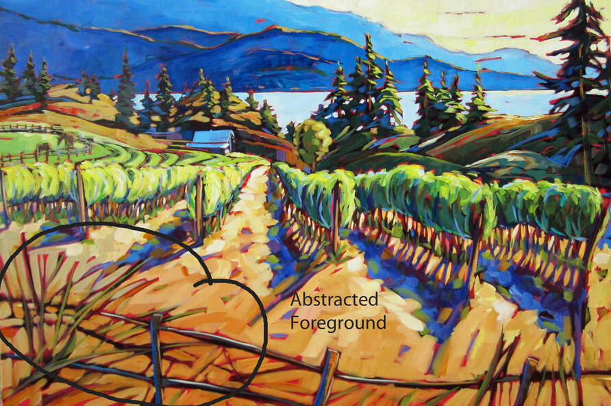
Foregrounds can be so difficult to do sometimes. You don't want the viewer to get "stuck" there and not meander further into the painting because you put so much details into your foreground. On the other hand, the foreground is the anchor of the painting. That's why I like to make mine often colorful but abstracted to that it may be interesting without being arresting. The devil is in the details, they say...
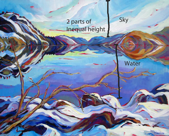
I find it more interesting to divide a "sky and water" painting so that the 2 parts are unequal. You can decide which one will be bigger but they are less likely to compete if they are given different size portions (the opposite of real life with two four-year old kids sharing a pop).
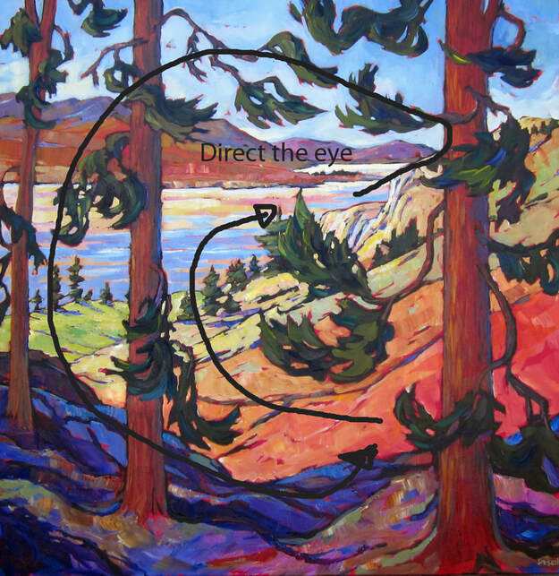
Purposely try to direct the eye of the viewer from the most likely entry point to around the painting. A little attempted manipulation is not illegal, right? Apparently, most people in the western world scan a painting from left to right because that is how they learn to read. Once the viewer "enter" the painting, it's ok to use shapes within the painting to influence where their gaze will travel. The longest the travel, the better.
|
Archives
November 2020
Categories |
 RSS Feed
