|
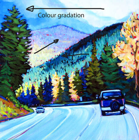
When at all possible (and why would it not be?) try in incorporate a gradation in colour throughout a shape from top to bottom or right to left. Like within the shape of the sky, or a big hill or mountain, or the surface of a lake. Going from a darker tone to a lighter one, from one colour to another one. It always creates interesting effects and keep the viewer viewing!
0 Comments
Leave a Reply. |
Archives
November 2020
Categories |

 RSS Feed
