|
Using neutral colours (made by mixing a tertiary colour or mixing complementary colours together) like a yellow mixed with a little blue violet, can off set pure expressive colours a lot more than when the entire painting is made with bright saturated colours. It's like eating just super sweet foods and super salty foods without having some bland food in between to cleanse the palate. Bread would do the job but with a painting, neutrals do it just as well! 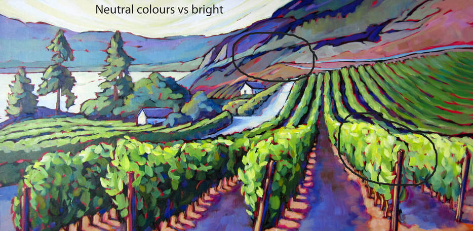 Different viewpoint 18x36
0 Comments
Leave a Reply. |
Archives
November 2020
Categories |
 RSS Feed
