|
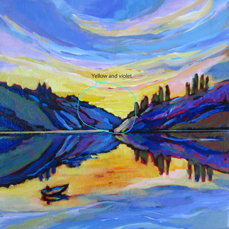
Not wanting to be Capt'n Obvious here but Shadows run from the object in the opposite direction to where the sun is and Reflections in the water always run directly toward the viewer. So 2 different things to consider if painting the edge of a lake on a sunny day. The Shadows might be pointing west (if the sun is in the east) but the reflections will be pointing south if looking in the direction of true North. An image is worth a thousand woods: here the trees are reflected in the water with their reflection running toward the bottom of the painting (or the viewer as always) and the shadows of the reeds on the dead tree are dependent on the direction of the sun which is on the left side of the painting as this is morning on Skaha lake looking South. Simple right? 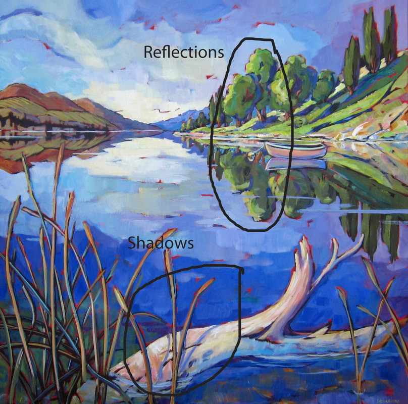
1 Comment
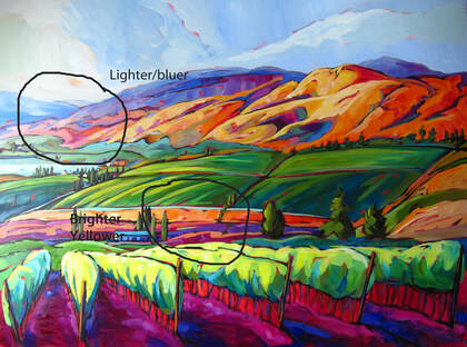
Nothing says more "come along, come on, follow this road" than a pathway/back alley which opens up at the bottom of the painting. But then again, even if you love to get away with "crazy bold colours" or all kinds of objects (garbage bins, garages, trailers, meandering marauders) along that road, you still have to respect one rule: the rule of perspective. With progressively decreasing objects' size lining the road and a single point of perspective (lines pointing to one point in the distance). Otherwise, if it's all wrong, one feels light headed looking at the painting or perhaps even slightly nauseated, not knowing for sure what's wrong, oh-my-let's-look-at-something-else-instead kind of feeling. so draw some lines if needed and keep to the overall directives. Ok the road may go up and down a little but you get the idea. You may now enter... 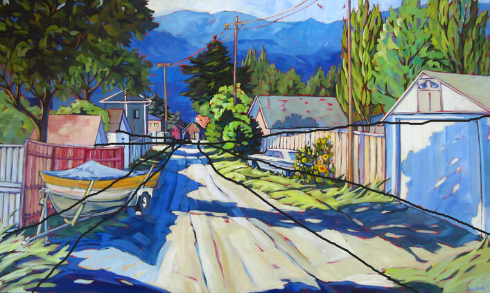 Slendid idea 36x48 When we look outside, we all instinctively know what is far and what is close to us. But try painting that and be convincing? That's when you want to use 'atmospheric perspective'. Due to the layer of atmosphere (air) between the object and the viewer, the far away objects appear whiter and bluer. Keeping this in mind while painting gives depth to the landscape painting.
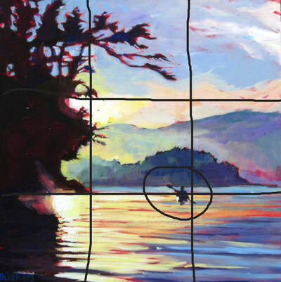
Every artist has been told to have a focal point in their painting. "It's the entry point! It grabs the attention of the viewer!" But it's just (sometimes) hard to either choose one or even remember to put one in. So what if you missed planning your composition with the all important focal point at the typical intersection of the thirds (painting cut in thirds with lines intersecting in 4 spots). Just add it in, with more contrasting colours, or more details, or more texture. Try it, add one in if forgotten it will help harmonize and balance the painting.
I am so excited about going to Calgary for the unveiling of the mural that the International Avenue's BRZ has commissioned me to do. I actually painted a 1x4 foot painting and they are enlarging it to 4x16 feet to be posted on the Tim Horton at 4710 17 Avenue SE. This is part of the rejuvenation effort from the International Avenue's BRZ for this area, where multiple murals representing many of the different cultural groups have been painted along the avenue. My painting will represent another aspect of the community. 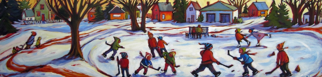 I have just finished posting my new Okanagan Series. I am becoming slightly obsessed with the trees here in Penticton. They way they cut the background decor into delicate patches of colour. I for always attempt to capture their individual character as each tree is so different not only in shapes but also in the mood or personality that its boughs speak to all.
So I finally got around to set up a new website that I can change whenever I want! Yeah!
Welcome to Deselliers.ca! Feel free to let me know what you think of the paintings or the website. Thank you! |
Archives
November 2020
Categories |

 RSS Feed
